Certain aspects of typography can become particularly significant within a genre. Within this article are some compiled examples of genre-based clichés using typography.
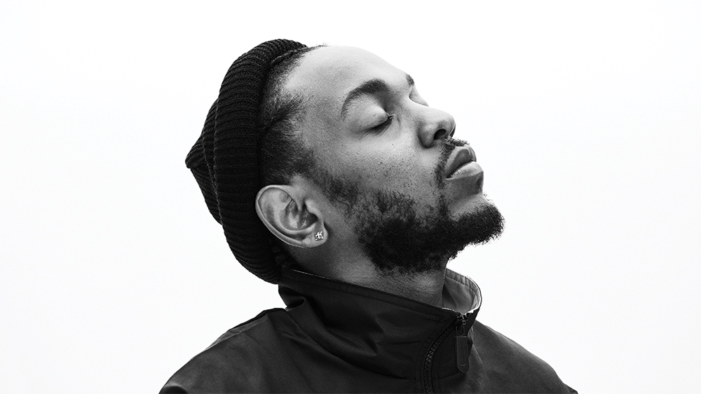
Kendrick Lamar is the most critically lauded rapper of the 2010s without much deliberation. His conceptual records are so intricately crafted with collaborators whilst always remaining true to Lamar’s singular vision. His album cover art has always reflected the art within in a way that leaves the covers intrinsically linked with the songs attached.
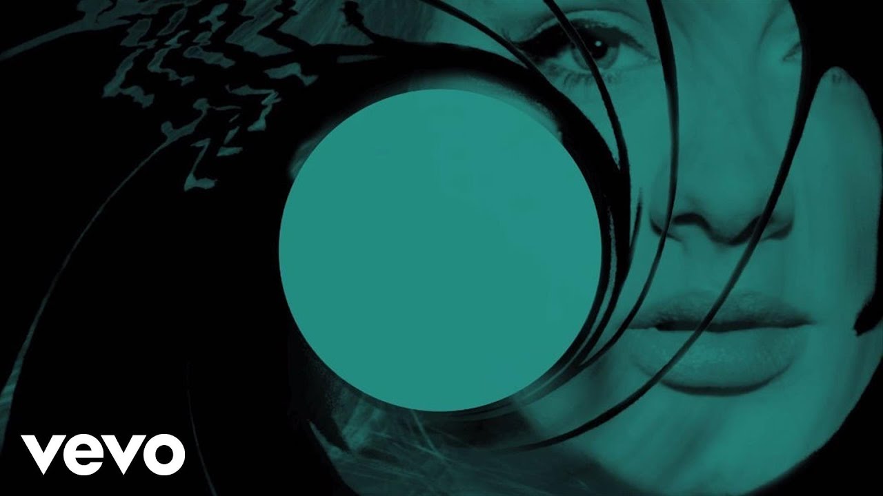
Lyric videos are an interesting concept. They exist to detail the lyrics of a song but are officially licensed by the publisher of the song and technically count towards official streaming numbers. Though they are not what is traditionally considered to be a music video, they have the unique challenge of transcribing lyrics in a manner that is legible yet stylistically engaging. The ways they engage the viewer can range from the typography and animation of the lyrics themselves or the background/ secondary content within the video. A prime example of a simple, yet elegant and engaging lyric video is Skyfall by Adele, the title theme for the similarly titled Bond film from 2012.
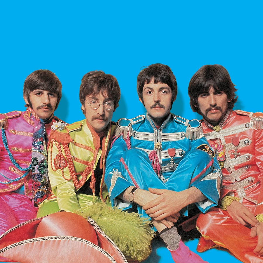
Potentially the most iconic band of all time, The Beatles’ album covers and their use of typography throughout their short but prolific career details their journey as a band and the material that they produced.
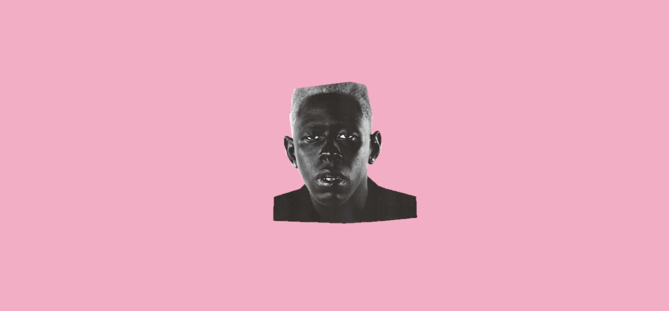
Though formed in 2007, LA-based music collective Odd Future began to gain notoriety in 2009 with the release of Bastard, the first official mixtape released by de facto leader Tyler, The Creator.
Album artworks can influence how certain projects permeate throughout culture and font selection is a large aspect of this. There are many iconic artists that have associated themselves with a particular aesthetic for extended periods of time; think of the iconic stylized font used for the AC/DC logo or the memorable yet minimal trademark font of fellow Australian music project Tame Impala (Microgramma).